
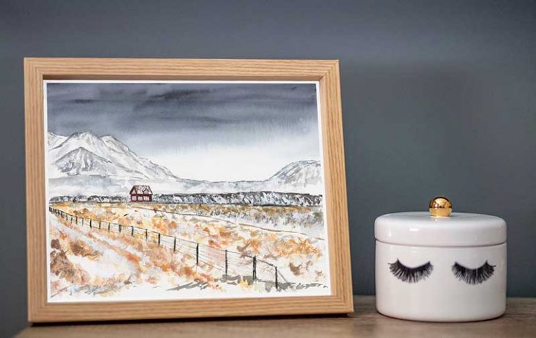
I recently painted an expressive Iceland watercolour landscape using a reference photo I took during a trip to the country in 2013. Today, I thought I would share the process of how I painted it.
My goal for this piece was to work on creating expressive brush marks, with a particular focus on dry brush techniques. However, I used a variety of watercolour techniques within the piece.
Read on if you want to learn how I created this piece. And, if you like the painting, prints of this piece are available to purchase in my shop.
SKetch

The first thing I did was lightly draw a sketch onto my watercolour paper. This was very basic but gave me some guidelines of where everything should be in the painting.
I drew the outline of the mountains, the little house and some important leading lines, including the fence.
Next, I painted masking fluid over the house to protect it. This was simply because I needed to preserve the white paper on the roof– which was covered in snow– as I can be a messy painter!
At this point, I could have also added masking fluid to areas where snow was throughout the painting. I decided against doing this, though. I think masking fluid is great and I use it a lot, but sometimes it creates harsh lines and I wanted to avoid this.
I also knew I wanted to use white gouache (in addition to utilising the white of the paper). I love using gouache to create snow as it adds a lovely texture to the painting.
Painting the Sky
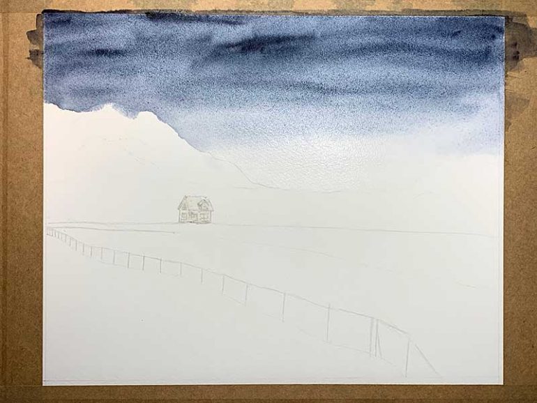
The sky in my reference photo was pretty dull and grey. So, I ventured away from that as I knew I wanted to have a dramatic, impactful sky.
To create the sky, I first pre-wet the area with water using a large brush. I did this as working wet-on-wet allows for seamless transitions in colour.
Next, I took some indigo mixed with a small amount of Payne’s grey and created a graduated wash; with the most intense colour being at the top.
I stopped adding pigment a little above the base of mountains so that there was an area of white within the sky too.
I was going to leave the sky as a smooth wash but, looking at it, I decided I wanted to add some more drama. Therefore, I took some indigo and Payne’s grey straight from the palette (so it was very intense in colour) and created brush marks through the sky.
As the paper was still wet, this bled out and blended nicely to create a very dramatic looking sky!
Adding to the Foreground
I then moved onto painting the foreground to allow the sky some time to dry. If I painted the mountains next– while the sky was still wet– the paint from the sky would bleed into the mountains.
As I was working quickly, I did get a little water on the top left mountain when I was pre-wetting the sky, so the paint moved into there. But that’s okay– it was only a small amount and I sort it later.
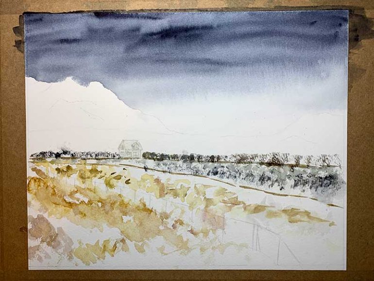
For the foliage in the foreground, I started by taking some watered down Quinacridone Gold, mixed with a little Carbazole Violet (to knock down the vibrancy). I also mixed a grey using Sepia and Indigo to add in areas.
Holding the brush far up the handle, I painted loose expressive brush marks onto dry paper for the clumps of grass. Think of the brush dancing around the paper.
Where the colour was looking a bit too solid, I splattered the paper with water to add a bit of variation.
Next, I took the colour on my palette that I just used and mixed it with the sky colour. I took this new mix of colour onto my brush, then dabbed it slightly onto my towel so that it wasn’t too wet.
I placed the belly of the brush onto the paper and dragged down to make some interesting dry brush marks, running across the paper.
As I was creating these marks, I added some Sepia into the mix to add some slight variations to the colour.
I also used this colour to create the leading lines in the painting. Here, I used glancing strokes with the brush to create the lines rather than painting one solid line.
Continuing the Foreground
Once my first layer of paint was dry in the foreground, I began to build up the colours.
I used mixes of Quinacridone Gold, Raw Sienna, Carbazole Violet and Indigo (constantly changing it up to create interest).
Like before, I worked wet on dry but splattered water in places where I felt the colour was becoming too solid.

Working On The mountains
While the foreground dried, I began working on the mountains behind the house. By this time the sky was completely dry.
I used a mix of Indigo and Sepia to paint the mountains. I started with a light colour (so a mix with more water added), allowed this to dry and then used a darker variation of this colour to add definition.
The mountain range in the reference photograph had light values as it was far in the distance. I wanted them to appear more defined in my painting but opted to stay true to the lighter values so that the house stood out against them.

Adding Gouache
Next, I added some white gouache straight from the tube to the painting. I added it to areas where I felt I needed to break up the colour a bit more. And, to areas where I hadn’t been careful enough to preserve the white of the paper (told you I was a messy painter!).
I didn’t overthink this: I simply added it to wherever I felt it was needed. Again, I was very loose with how I applied it.
I just love the texture that gouache adds to the painting!
Painting the Fence
I opted to include the fence that was in the reference photo as I like the leading line it creates. I mixed a dark using Indigo and Sepia and painted the fence using a rigger brush.
I kept the mix of paint quite thick and scribbled with the paintbrush to create dry brush marks. I didn’t want solid lines for the fence as I felt that would be too distracting. So I literally used an up/down or left/right scribbling motion to paint it.

Painting the House
Finally, it was time to remove the masking fluid protecting the house and paint it. I mixed Alizarin Crimson with a touch of Hooker’s Green for the house. I also used the dark mixture that was already on my palette for the darker/shadowed areas.
I achieved the snowy look on the roof by using a dry brush mark: dragging the belly of the brush down.
For the windows, I used a very watery mix of Indigo and Sepia.
At this point, I realised the house needed some more definition. So, I went over it again with Alizarin Crimson straight from the tube.
Final Touches
I always like to step away from my painting and then come back with fresh eyes to see if it needs anything more. I decided to add some more Quinacridone Gold and Alizarin Crimson (mixed with a touch of Indigo) to further add warmth to the foreground.
And, that was me done! I hope you like the finished painting.
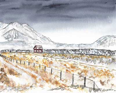
PURCHASE PRINTS OF MY ICELANDIC LANDSCAPE
FURTHER READING:
- Eucalyptus Watercolour Painting [+ Timelapse Video]
- Orca Watercolour Painting [Video]
- Discover My Eco-Friendly Greeting Cards Range
Share on Pinterest: